This license package contains the methods Principal component analysis, Multidimensional scaling and Correspondence analysis
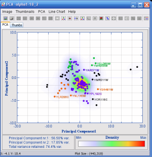
The PCA tab shows a 2D plot of the dataset. The axis chosen by default are the ones that result in the highest total variance. Each profile is represented in the PCA plot as a dot. Additionally, the density of dots in each local area is indicated by a range of colors (by default white (lowest density) through blue and red to yellow (highest density)). Thus high numbers of dots in an area will be obvious, even though the dots more or less overlap. If a dataset is large, or the data is centered in a relative small area, it is possible to define a threshold value. If the dot density exceeds this value, the dots will be removed in this area. This makes it easier to see the underlying structure of the spread of the plot, and identify and select outliers. The variance of the axis, and the total variance for the plot are displayed in the bottom left corner.
The Multidimensional scaling method is similar to the PCA method except that it will use a different method to find the two axes.
Correspondence analysis is an explorative computational method for the study of associations between variables. Much like principal component analysis, it displays a low-dimensional projection of the data, e.g., into a plane. It does this, though, for two variables simultaneously, thus revealing associations between them.
For more information, see Correspondence anaylsis applied to microarray data. Fellenberg K, Hauser NC, Brors B, Neutzner A, Hoheisel JD, Vingron M. Proc Natl Acad Sci USA. 2001. 98(19): 10781-10786.

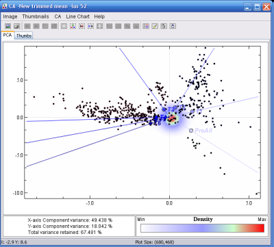
Correspondence analysis example
See how some gene clouds (black dots) are associated with the different sample groups
(blue lines, darker lines equals longer time span in a time span experiment).
