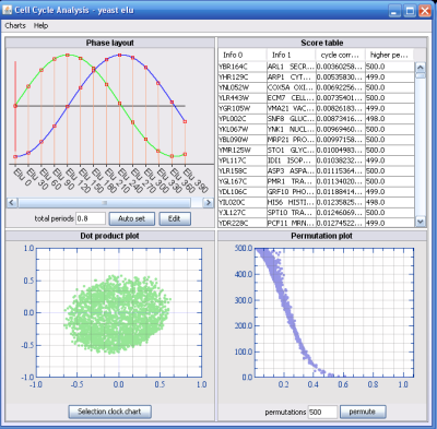
The time series analysis (Cell cycle analysis) component can be used to find genes resembling a periodic regulation. The Phase chart lets you select the number of phases in your experiment. For instance, if the experiment are arrays from samples taken every hour for one day, you have one phase. If you sample for two days, you have two phases etc. The green curve is the sine function and the blue is the cosine function. By pressing the "Auto Set" button, J-Express will predict the best phase settings, but prediction will assume that the time between each sample is equal. If this is not the case, you will have to use the "Edit" button to manually lay out the samples across the phase setting.
The dot product plot shows the rows in your dataset projected on the sine and cosine vectors defined in the phase component. In short, genes showing low or none periodic patterns will be located in the center of the plot while periodic genes will be located further from the origo. The x-axis in this plot is the sine function and the y-axis is the cosine function.
The score table sorts the genes according to the permutations performed and is linked to the permutation plot. This displays "Cycle correlation" as
Math.sqrt(sineprojection^2 +cosineprojection^2)
and "Higher permuted correlation" as number of permuted Cycle correlations above the un-permuted gene.
