Box Plot
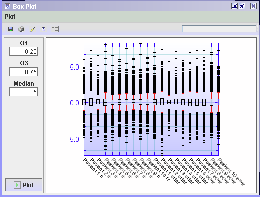
The box plot shows how the expression values are distributed for each sample in your data set. These distributions need to be similar for the different samples to be comparable. If this is not the case, the data should be normalised by e.g. Quantile Normalisation for one color systems and Scale Normalisation for two colour systems. Below is a description of a box plot.
Here is a description of how you can read a box plot.
The 0.5 quantile value means that 50% of the data is below this value and 50% is above. Q1 is the median value for the lower half of the values, and Q3 is the median value for the upper half of the values. This means that 50% of all of the data values will be inside the box.