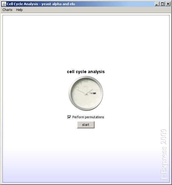
This component can be used to look for genes that follow periodic cycles. It does so by projecting the genes into the space of sine and cosine.
The Cell cycle analysis window is divided into four areas:
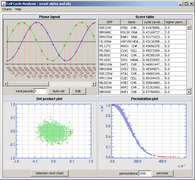
Use the Permutation plot or the Score table to locate the intersting genes. By selecting them, they will also be high-lighted in the Dot product plot. Remember that these genes will also be selected in the core of J-Express, which means that you can branch the genes off to a separate data set using the Create Groups component.
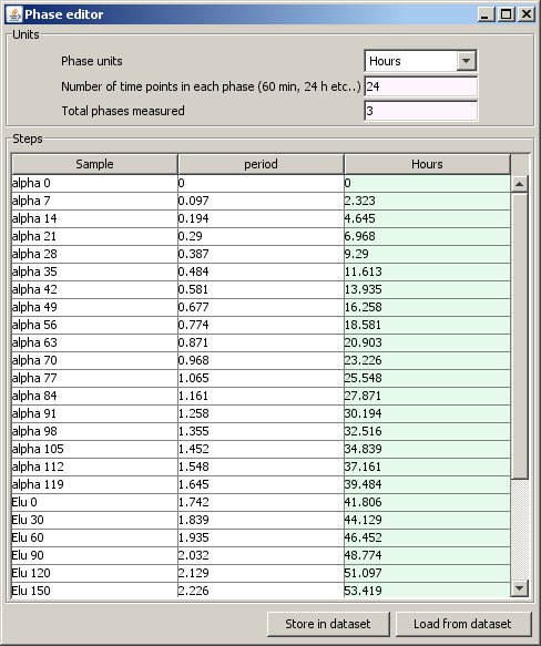
The Phase layout shows a graph of sine in green and cosine in blue. The samples from your dataset are layed out along the x-axis and red lines are drawn to show corresponding time points and phase. If the dataset have equal amount of time between each time point, the red lines are drawn parallell to the y-axis. If you have used the Phase editor to adjust the time points, then some of the red lines will be drawn at an angle to show where in the phase the time point correspond.
The score table sorts the genes according to their correlation with sine and cosine, which is displayed in the cycle correlation column. The cycle correlation is calculated as Math.sqrt( sineprojection^2 + cosineprojection^2 ). Random projections can be calculated by clicking on the permute button under the Permutation plot. The higher permuted correlations column contains the number of random projections that has a better correlation.
The score table is linked to the permutations plot. Genes selected in the score table will be highlighted in the permutation plot, and vice versa.
This plot shows the projection of your dataset onto the sine and cosine vectors defined in the Phase editor. Genes shoing low or no periodic patterns will be plotted near the origin, while periodic genes will be located further out, away from the origin. The x-axis in this plot is the sine function and the y-axis is the cosine function. Genes selected in the Score table or Permutation plot will be marked in the Dot product plot.
The permutation plot is linked in particular to the Score table since the cycle correlations are plotted along the x-axis and the higher permuted correlations are plotted along the y-axis. The interesting genes, which are the ones with the highest correlations and the lowest number of higher permuted correlations can be found to the right of the x-axis, where y is approaching 0. Select the interesting genes and see that the selections also gets highlighted in the Dot product plot and the Score table.